Article Overview
The following article describes the Design properties of the Mirror component.
Viewing Design Properties
(See Figure 1 and Figure 2)
To view the design properties of the Mirror component, add it to the canvas and then use the dropdown to select a component to Mirror.
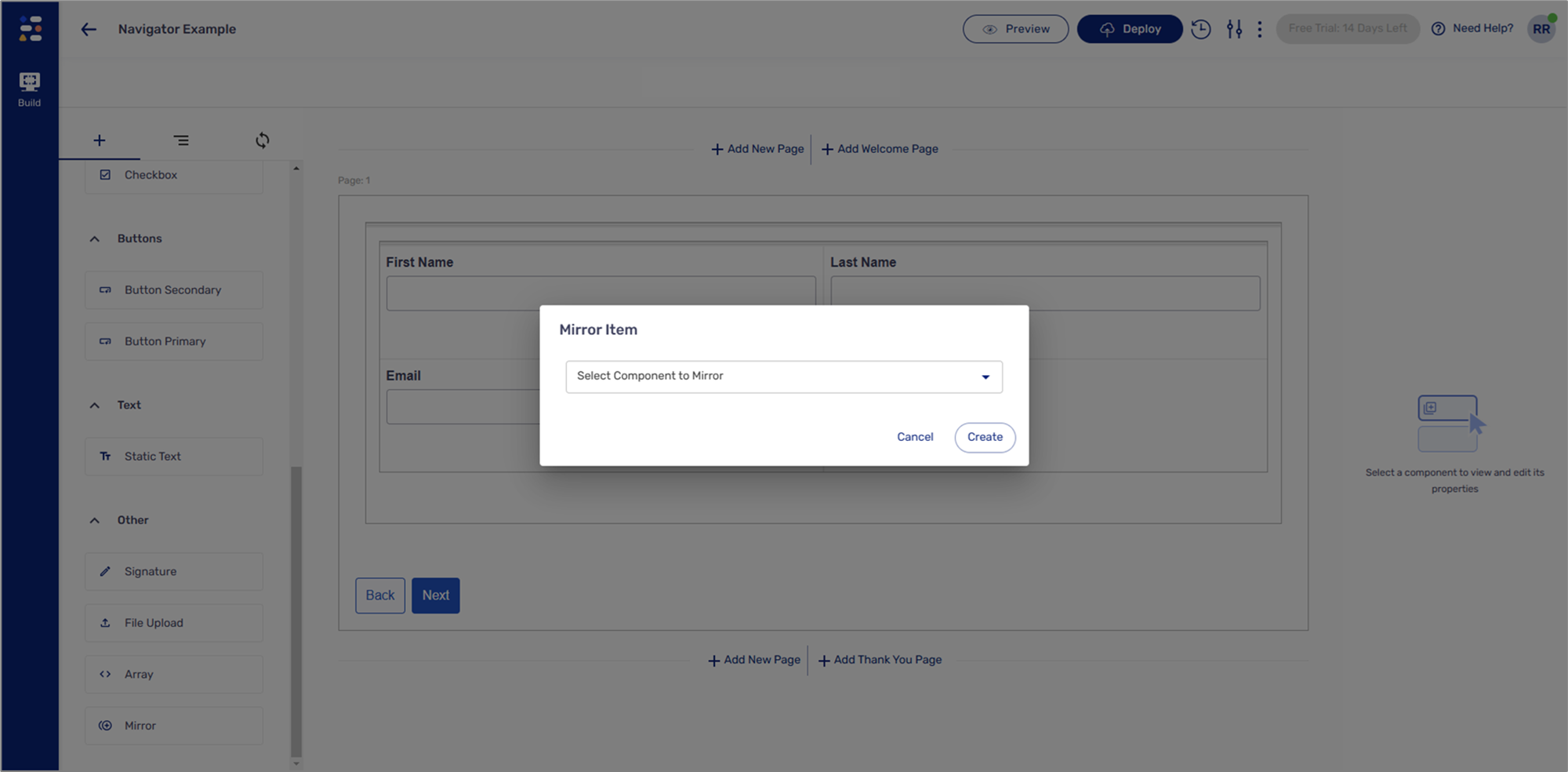
Figure 1: Mirror Item Dropdown
NOTE
You can only mirror the following components:
Text Area
Text Field
Date Input
The Mirror component will display the Design properties of the selected component, in addition to a property that disables it. For example:
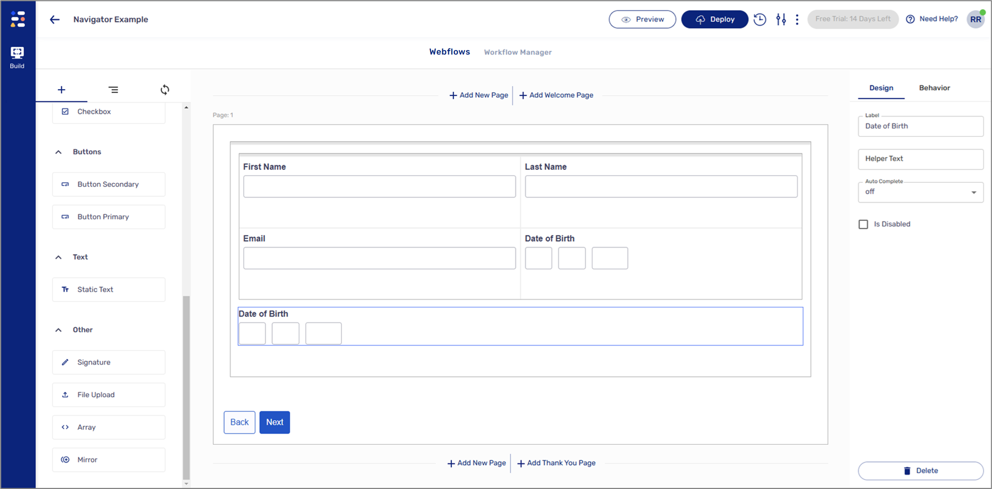
Figure 2: Design Properties