Article Overview
The following article describes EasySend’s Process Analysis tab. It details the different visualizations and what information each visualization displays.
The Process Analysis Tab
The Process Analysis tab displays dashboards that dive deeper into the details of a selected process filtered by date range. For example:
Total created/opened/completed/expired transactions per selected process
Geographical locations that map the number of transactions per location
Process transactions over time graph
Device usage diversity drill into a browser
Process conversion rate
Process duration change compared to last month
Process conversion rate change compared to last month
transactions level table with status filter - filtering sessions as well
Session level table - additional session level data - resolution, role, device
Displaying information according to the Webflow version to ensure no page changes
Pages visit duration - average duration spent on each page
Workflow steps reflected by name and index number
Validation errors triggered by the next-page action on a digital process
Process Analysis Tab Structure
(See Figure 1)
The tab is divided into two sub-tabs:
Process Analysis (1)
Page Visits (2)
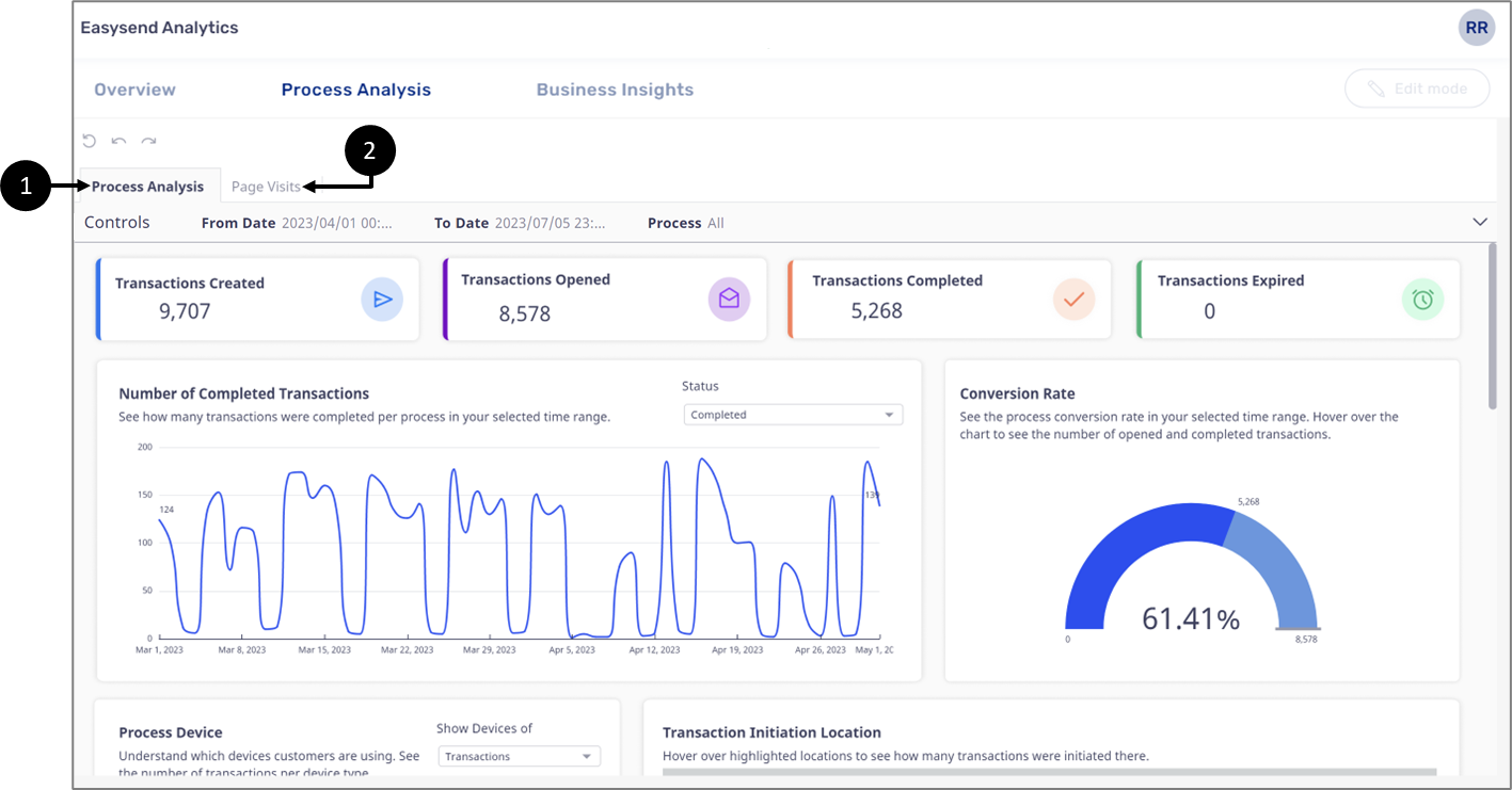
Figure 1: Process analysis Tab
Process Analysis Sub-Tab Structure
Figure 2 and Table 1 describe the structure of the Process Analysis sub-tab.
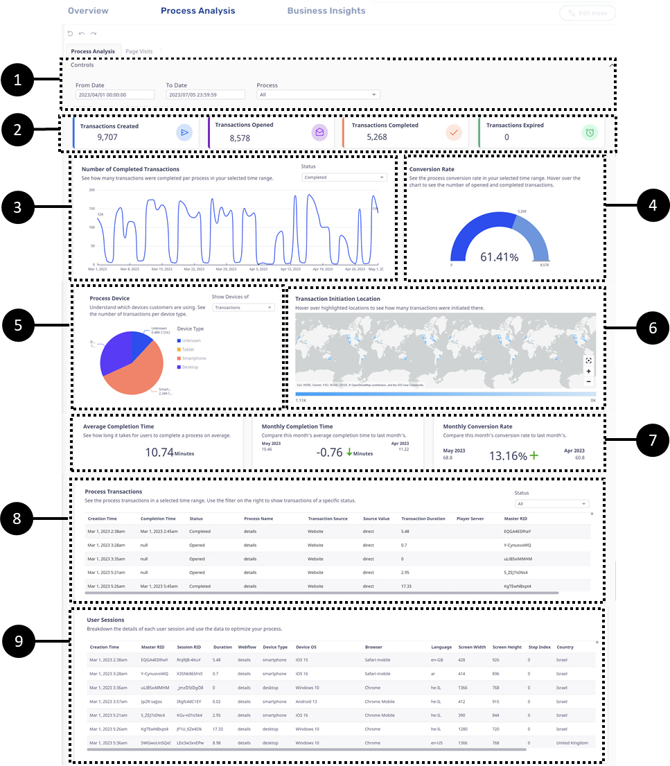
Figure 2: Process Analysis Sub-Tab
Table 1: Process Analysis Sub-Tab
NOTE
The data displayed in the different sections is refreshed automatically once an hour.
Process Analysis Controls (1)
(See Figure 3 to Figure 6)
The Controls section enables you to filter and adjust the information displayed in the Process Analysis sub-tab. It contains two filters:
From/To Date:

Figure 3: From/To Date
Process:
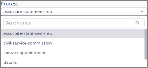
Figure 4: Process
The filters can be reset by clicking the three dots located above (1) and then Reset (2). The page reset icon (3) rests all the filters at once.
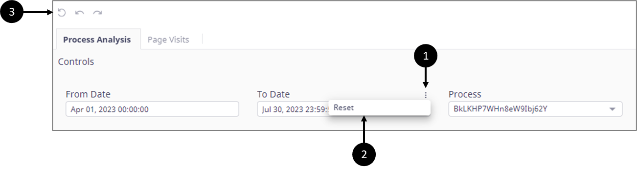
Figure 5: Reset
The Process filter also has a Refresh option (4) to update the visualizations with live data.
Figure 6: Refresh
Transaction Status (2)
(See Figure 7)
Under transaction status, you view how many transactions were:
Created
Opened
Completed
Expired

Figure 7: Transaction Status
The displayed information can be filtered and adjusted according to the Controls section filters.
NOTE
If you have expired transactions but Expired displays 0, your environment servers are not updated with the latest version.
Transaction’s Life Cycle
A transaction is an instance of a process. Each transaction has a life cycle comprised of three stages:
Created
Opened
Completed
NOTE
If a transaction is not completed within a configured timeframe it will become Expired.
Created Transaction Status
A transaction receives a Created status when it is generated by EasySend, for example:
By using the Journey Sender/Bulk Sender
By clicking an organic link (website)
Calling an API
Executing integration (Salesforce, Dynamic 365, Guidewire)
Opened Transaction Status
When the link of a transaction is clicked and accessed, its status changes to Opened.
If a transaction has several steps (each one for a different end-user), the last click to open the transaction will be counted for analytics.
Completed Transaction Status
The end-user interacts with the transaction until it is submitted. Once submitted, its status changes to Completed, and the life cycle of the transaction ends.
If a transaction has several steps (each one for a different end-user), only the final submission will be counted for analytics.
Example
A transaction for customer onboarding was generated by EasySend, and its link was sent to the customer’s email. At this stage, the status of the transaction is set to Created.
The customer clicks the link to access the transaction to start it. At this stage, the status of the transaction is set to Opened.
While interacting with the transaction, the customer specifies that a spouse must be involved in the onboarding process, so an additional step must be completed.
The customer submits the transaction to finish with the first step. At this stage, the status of the transaction remains Opened.
The spouse receives an email and interacts with the transaction until the step is finished and submitted. At this stage, the status of the transaction is set to Completed.
Number of Transactions (3)
(See Figure 8 to Figure 10)
The visualization displays the number of times a process’s transaction was:
Created
Opened
Completed
Expired
on a specific date. The information is displayed according to a selected status (1) and according to the filters located in the Controls section.
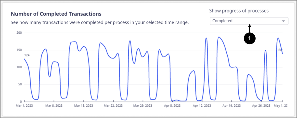
Figure 8: Number of Transactions
Hovering over any part of the visualization displays the exact number of transactions in their selected status, for example:
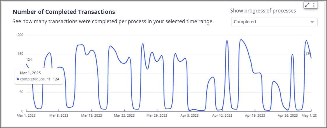
Figure 9: Hover Information
When clicking the visualization, an option to reset it appears (2). Clicking Reset (3) reverts the visualization to its original state (COMPLETED).
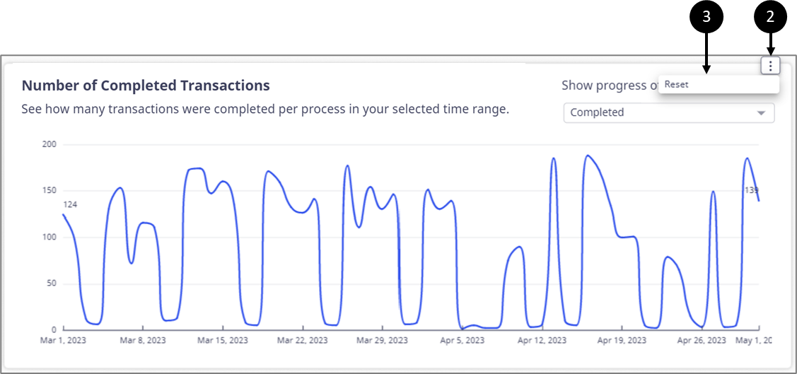
Figure 10: Reset Option
Conversion Rate (4)
(See Figure 11 and Figure 12)
This visualization displays a process’s conversion rate. The information is displayed according to the filters located in the Control section.
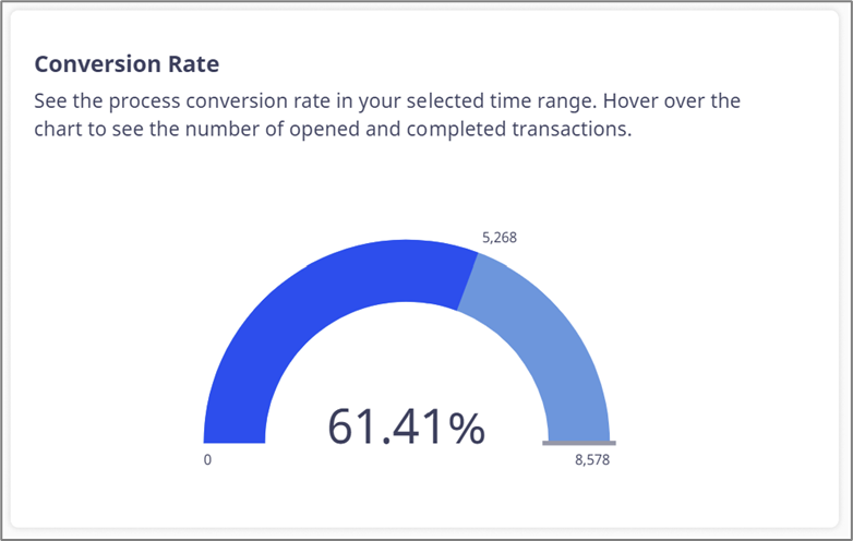
Figure 11: Conversion Rate
Hovering over any part of the visualization displays its legend, for example:

Figure 12: Conversion Rate Legend
Processes Device (5)
(See Figure 13 to Figure 16)
This visualization displays the devices from which the process was opened for an entire transaction or each session in the transaction. The information will be displayed according to a Transactions/Sessions (1) selection and according to the filters located in the Control section.
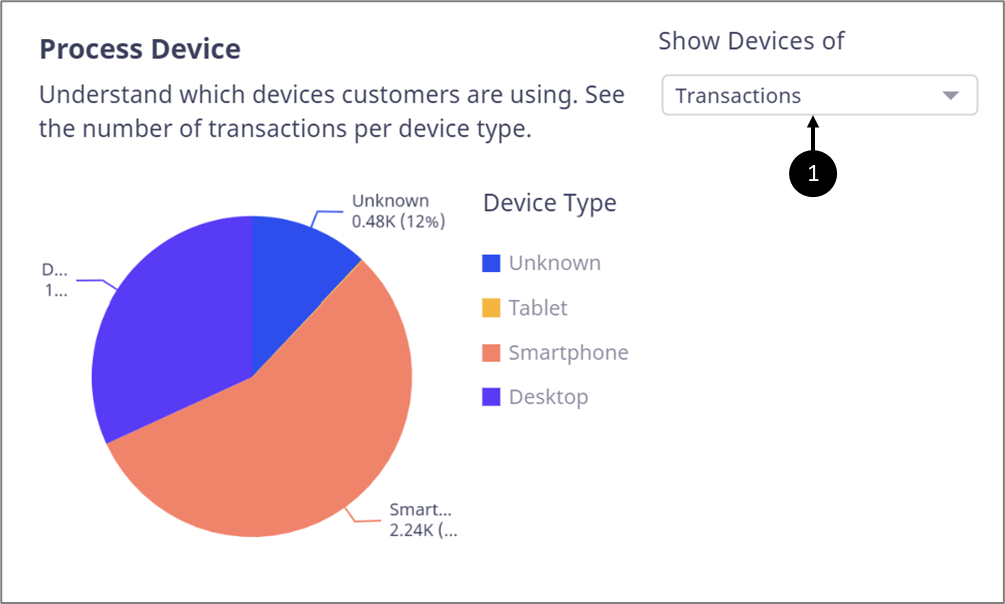
Figure 13: Processes Device Type For Transactions/Sessions
Hovering over any part of the visualization displays information about the specific device type (2). Clicking any part of it enables the user to perform a drill down or a drill up (3), for example:
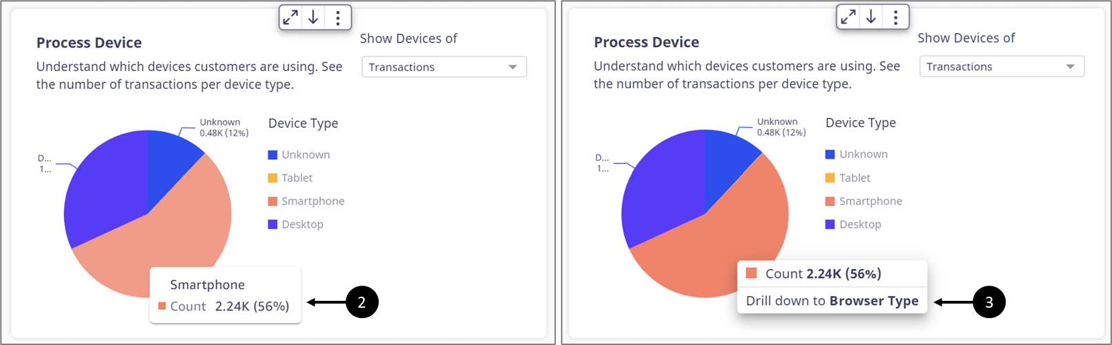
Figure 14: Hovering and Drill Down
Drilling down a device type displays the type of browsers that were used with it to open the process (for an entire transaction or each session), for example:

Figure 15: Browser Type
When clicking the visualization, an option to reset it appears (4). Clicking Reset (5) reverts the visualization to its original state (Transactions).
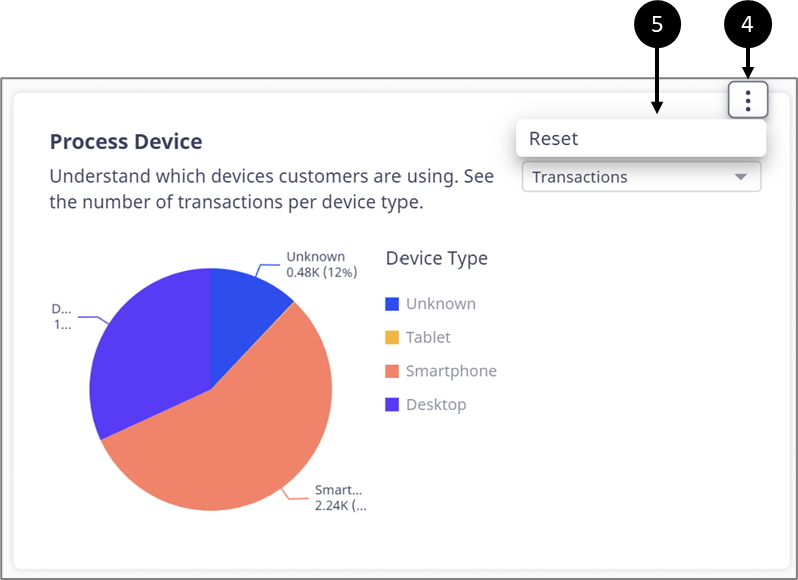
Figure 16: Reset Option
Transaction Initiation Location (6)
(See Figure 17)
This visualization displays the total number of initiated transactions per location. The information will be displayed according to the filters located in the Control section.
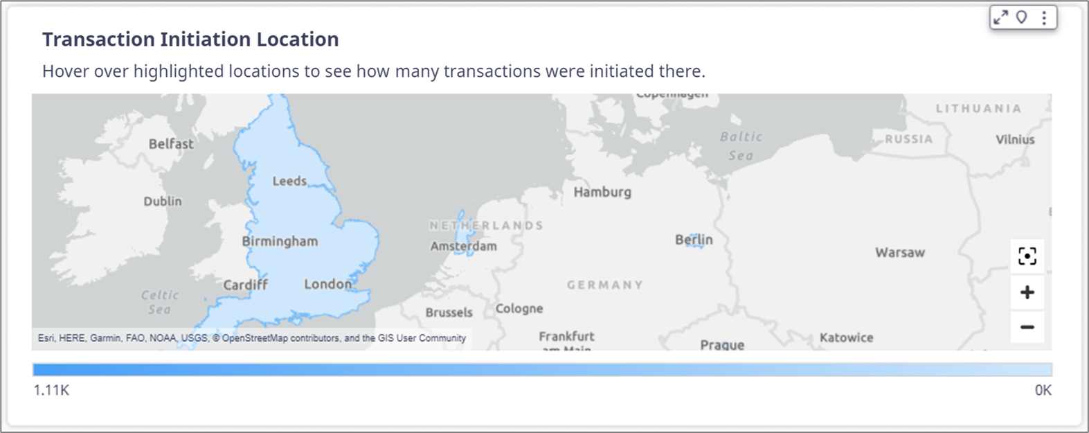
Figure 17: Transaction Initiation Location
Hovering over marked parts in the visualization displays the exact number of initiated transactions per location, for example:
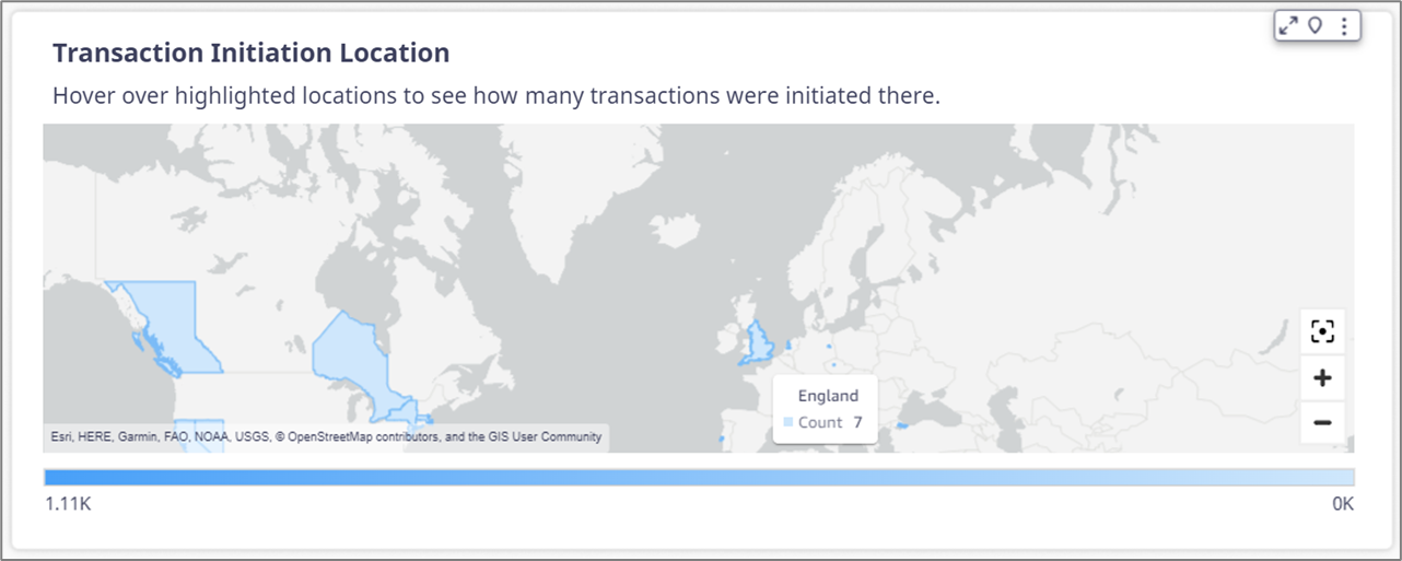
Figure 18: Hovering Information
Averages and Trends (7)
(See Figure 19)
Under averages and trends, you view:
Average Completion Time - how long it takes for users to complete a process on average.
Monthly Completion Time - compare this month’s average completion time to last month's.
Monthly Conversion Rate - Compare this month’s conversion rate to last month's.

Figure 19: Averages and Trends
The information is displayed according to the filters located in the Control section.
Process Transactions (8)
(See Figure 20 and Figure 21)
The table displays information about transactions according to a selected status (1) and according to the filters located in the Control section. The information includes:
Master Request Identifier (RID)
NOTE
The Master RID is a unique ID of an EasySend transaction.
Status:
Completed
Opened
Created
Expired
Creation time and date
Compilation time and date
Process Name
Transaction Source:
Website
Agent/Rep
External app
Bulk/process distribution
Salesforce
Duration (minutes)
Current Step:
Not opened
Name of the current step
Process completed
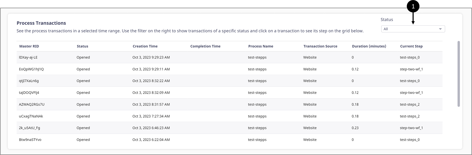
Figure 20: Process Transactions
NOTE
The headers of the tables are sortable.

When clicking the table, an option to reset or refresh it appears (2). Clicking Reset (3) reverts the visualization to its original state (All status) and when clicking Refresh (4) the table is updated with live data.
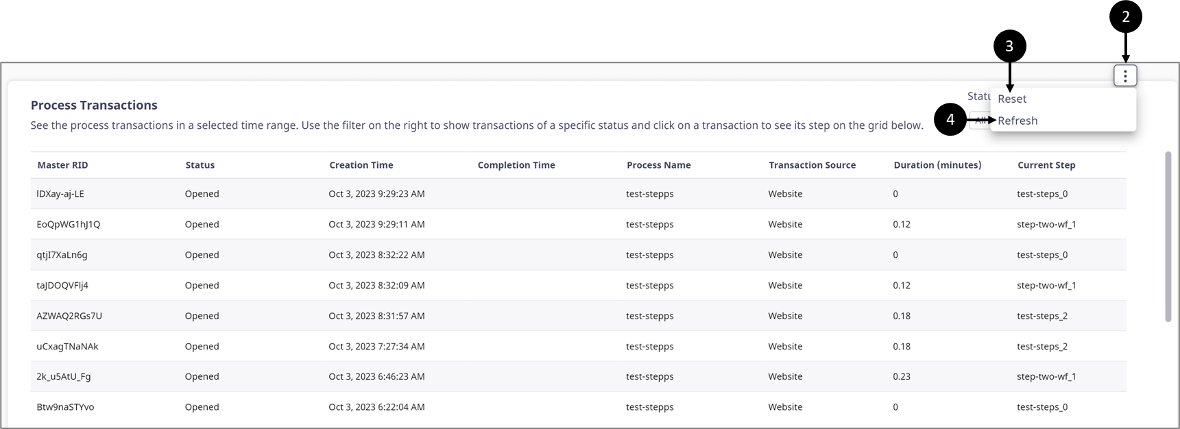
Figure 21: Reset and Refresh Options
Transaction Steps (9)
(See Figure 22 and Figure 23)
This table explores and breaks down each transaction in the Process Transactions table. The table provides a deeper understanding of the transaction by displaying detailed information about its steps:
Master RID
Step Name
Step Number
Step Status:
Created
Opened
Completed
Creation time and date
Open/Completion time and date
Last Interaction
NOTE
Interaction events can be navigating between pages or submitting
Duration (minutes)
Step Role
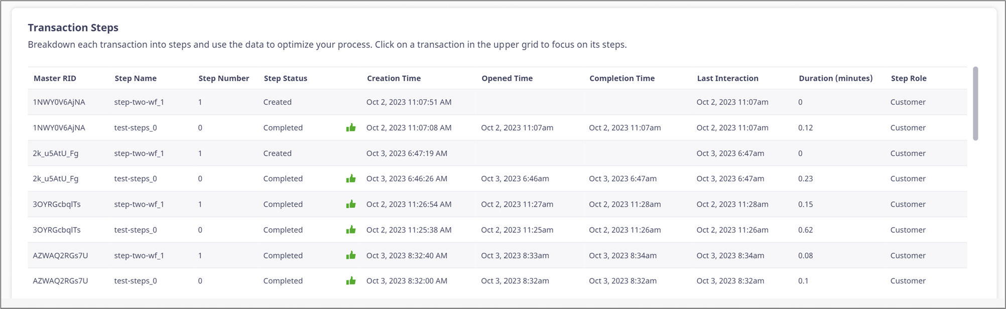
Figure 22: Transaction Steps
When clicking a transaction from the Process Transactions table, the Transaction Steps table is filtered and updated according to it, for example:
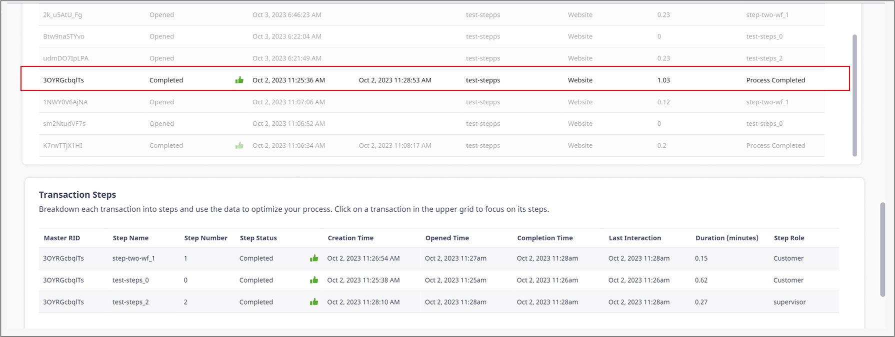
Figure 23: Filtered Table
Page Visits Sub-Tab Structure
Important!
Please note that if Page Visits is not available and the following message appears:
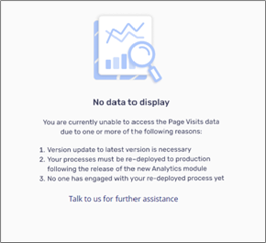 Please follow the instructions on the screen or click the link for further assistance.
Important!
If Page Visits data is available but you are missing data from specific digital processes, please redeploy them.
Figure 24 and Table 2 describe the structure of the Page Visits sub-tab.
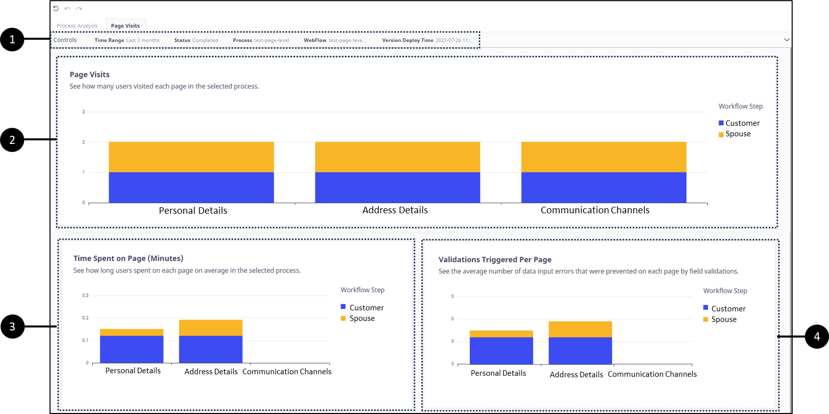
Figure 24: Page Visits Sub-Tab
Table 2: Page Visits Sub-Tab
NOTE
The data displayed in the different sections is refreshed automatically once an hour.
Page Visits Controls (1)
(See Figure 25 to Figure 31)
The Controls section enables you to filter and adjust the information displayed in the Page Visits sub-tab. It contains five filters:
Time Range - by default, the selected time range is Last 3 months. When selecting a time range, the rest of the filters are updated.
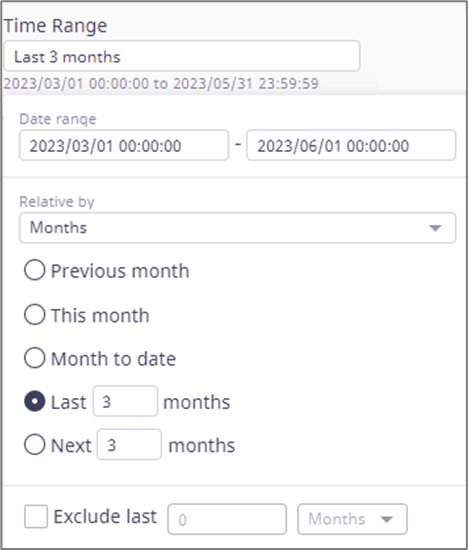
Figure 25: Time Range
Status - displays a list of statuses according to a selected time range. By default, the selected status is opened. When selecting a status the Process, Webflow, and Version Deploy Time filters are updated. The status options are:
Select all - displays a list of all the processes in any status.
Canceled - displays a list of processes that were canceled. For example, processes can be canceled by using the Journey Tracker.
NOTE
For additional information about the Journey Tracker, click here.
Completed - displays a list of processes that were completed.
Expired - displays a list of processes that expired.
NOTE
Usually, processes that were not completed within 30 days are expired and no longer valid. For additional information, please contact our support team.
Opened - the default value. displays a list of all the processes that were opened and not completed, canceled, or expired. This option is the best to use for investigating where the process is abandoned.
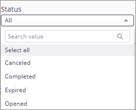
Figure 26: Status
Process - displays a list of processes that were deployed to a production environment and have page visits data (redeployed and engaged after the release of the Page Visits feature). The list will be updated according to a selected time range and status.
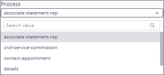
Figure 27: Process
Webflow - displays a list of Webflows according to the selected process.
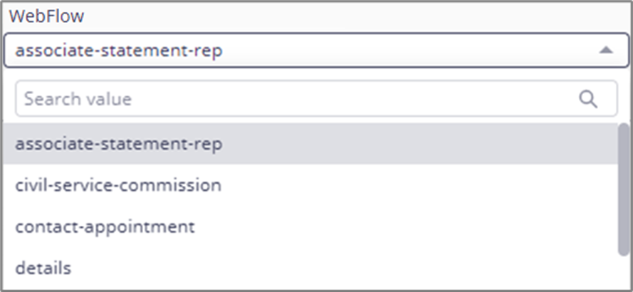
Figure 28: Webflow
Version Deploy Time - displays a list of version deploy times according to the selected Webflow. A version deploy time will appear in this list only if a process was deployed to a production environment after major changes were performed at the Webflow level such as:
A Webflow page name was changed
A Webflow page was removed
A Webflow page was added
A Webflow page order was changed
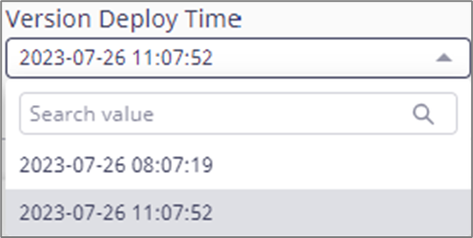
Figure 29: Version Deploy Time
Important!
When a filter dropdown, such as Process, Webflow, or Version Deploy, contains only one value, when that value is selected, the dropdown will display All.
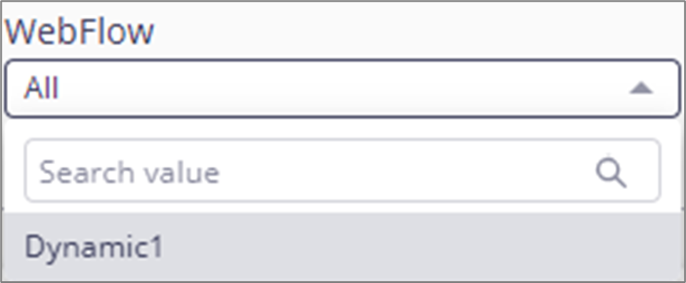
In some cases, when switching between filters, some values that belong to the previous filter may appear at the bottom of the list. When selecting an updated value, the old ones will disappear.
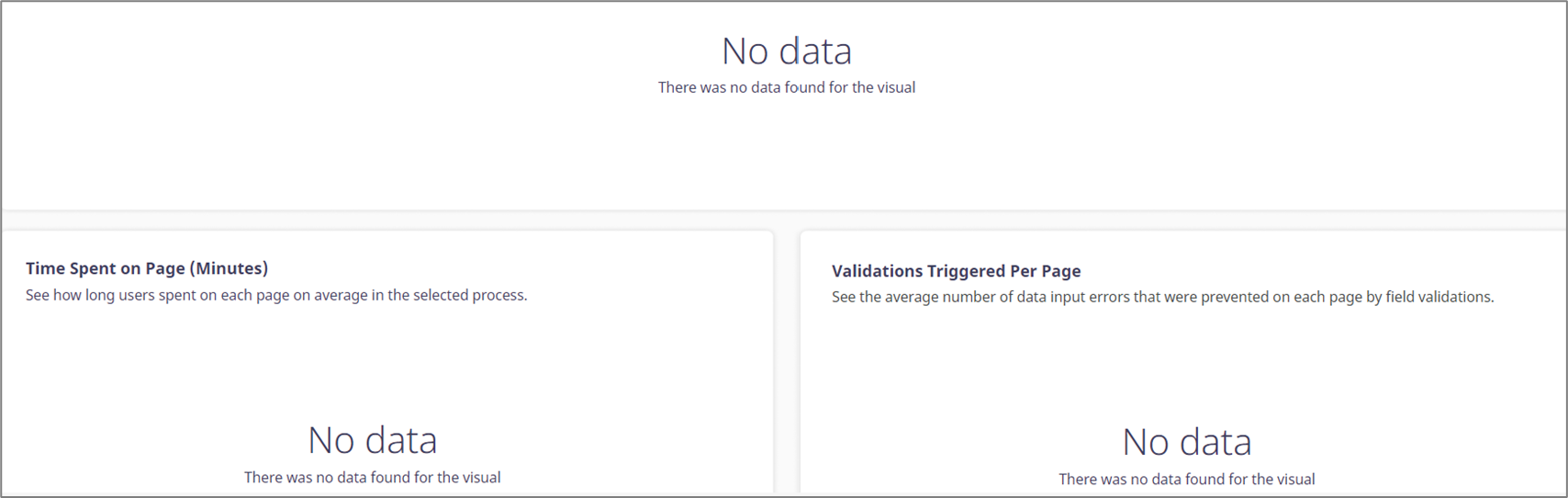
If the No data message appears within the visuals, after switching between processes or after changing filters, adjust and update them.
The filters can be reset to their default state by clicking the three dots located above (1) and then Reset (2). The page reset icon (3) resets all the filters at once.

Figure 30: Reset
The Process filter also has a Refresh option (4) to update the visualizations with live data.

Figure 31: Refresh
Page Visits (2)
(See Figure 32 and Figure 33)
The visualization displays the number of users who visited each page in each step of a selected process. Using this visual we can learn information such as:
Which pages were visited more than others
Where did a visitor drop occur (due to conditions or role permissions)
The information is displayed according to the setup in the Controls section.

Figure 32: Page Visits
Hovering over any part of the visualization displays the exact number of visits per page and step, for example:
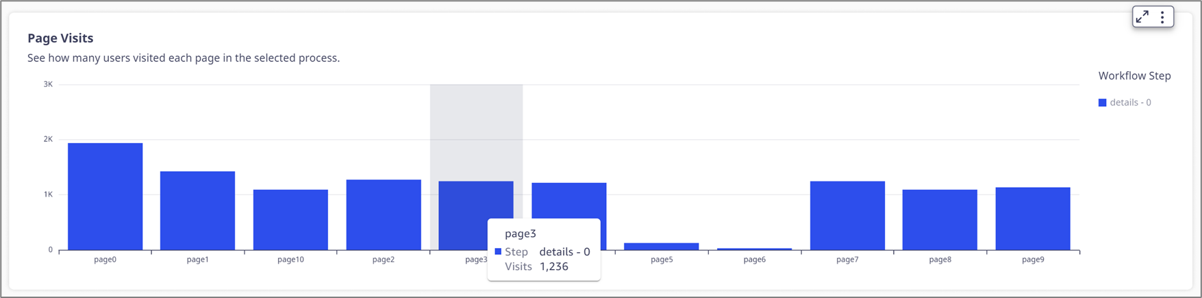
Figure 33: Hovering Information
Analyzing Multiple Steps
(See Figure 34)
When the Workflow of a Webflow contains several steps, for example:
Customer
Spouse
Agent
The visualization will display them under STEP NAME in a sequence:
Direct-debit - 0 (Customer)
Direct-debit - 1 (Spouse)
Direct-debit - 2 (Agent)
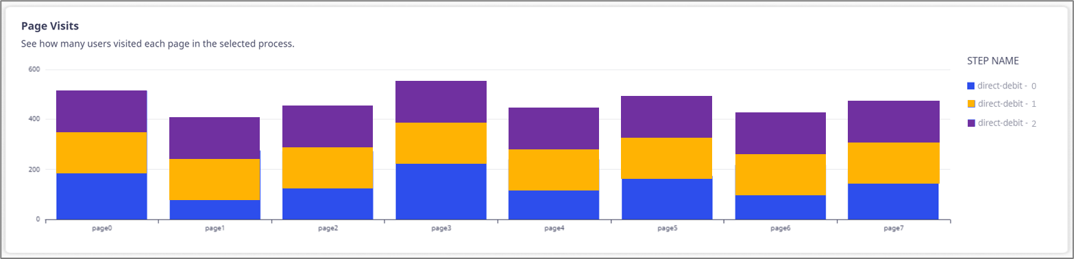
Figure 34: Page Visits and Steps
Time Spent on Page (minutes) (3)
(See Figure 35 and Figure 36)
This visualization displays how much time, on average, was spent on each page in each step. Using this visual, we can learn information such as which pages are more complex and cause visitors to spend more time on data input.
The information is displayed according to the setup in the Controls section.
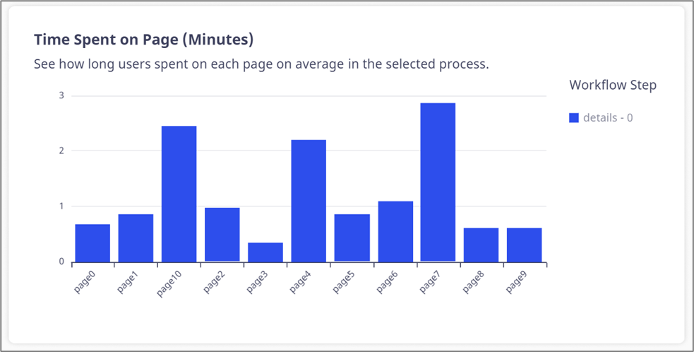
Figure 35: Time Spent on Page (minutes)
Hovering over any part of the visualization displays the exact time spent on the page for each step, for example:
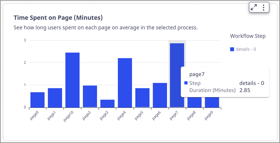
Figure 36: Hovering and Drill Down
Validations Triggered Per Page (4)
(See Figure 37 and Figure 38)
This visualization displays the average number of data input errors that were prevented on each page and step by field validations. Using this visual we can learn information such as which pages need to contain more explanations and examples for data input.
The information is displayed according to the setup in the Controls section.
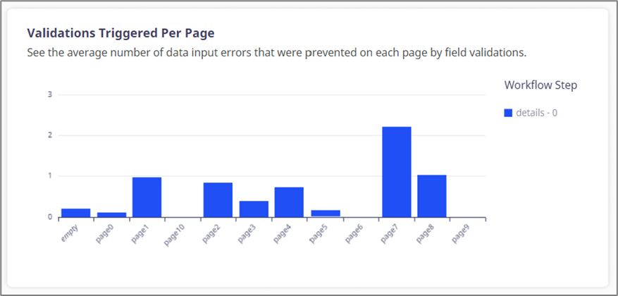
Figure 37: Validations Triggered Per Page
Hovering over any part of the visualization displays the average number of validations that were prevented on each page and step, for example:
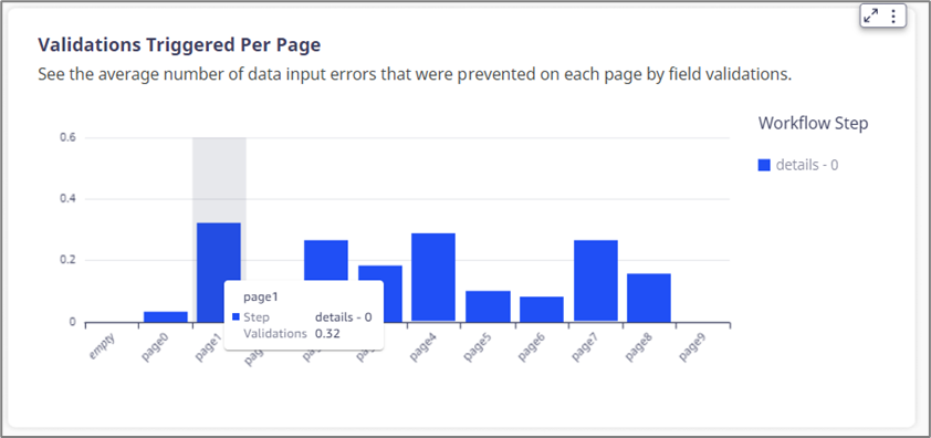
Figure 38: Hovering Information
Additional Options
(See Figure 39)
When clicking a visualization, additional options appear:
Maximize/Minimize (1) the visualization.
Drill down/Drill up (when available) (2).
Menu Options (3).
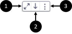
Figure 39: Conversion Rate Legend
Drill down/Drill up
(See Figure 40)
When this option is available, the user can drill down or up and view another level of the visualization. In the Process Analysis tab, this option is available in the Process Device for Transactions/Sessions visualization, for example:
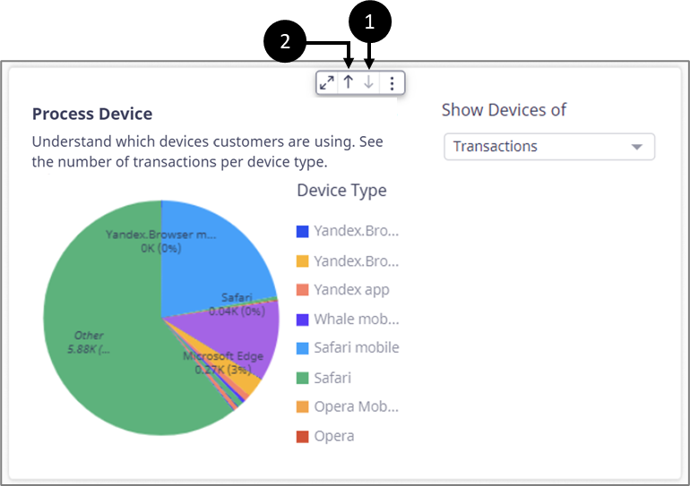
Figure 40: Drill Down/Up Options
After a drill down, the icon becomes disabled (1) and the drill up icon appears (2).
Menu Options
(See Figure 41 to Figure 43)
Contains the following options:
View summary data - displays a window with a textual summary of the visualized data.
Export to CSV - exports the visualization to a CSV file.
NOTE
An option to export to an Excel file is available for the Process Transactions and the User Sessions tables.
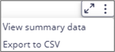
Figure 41: Menu Options
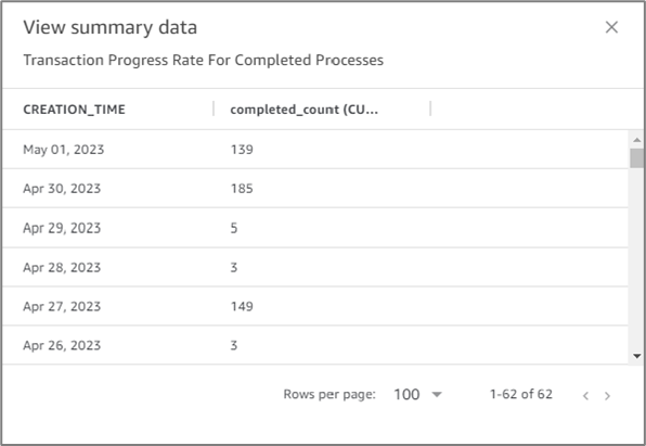
Figure 42: View summary data
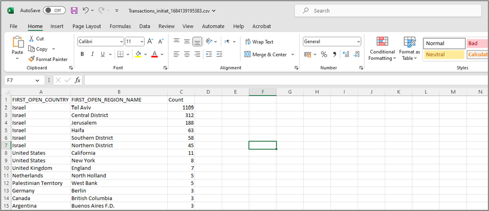
Figure 43: Exported CSV